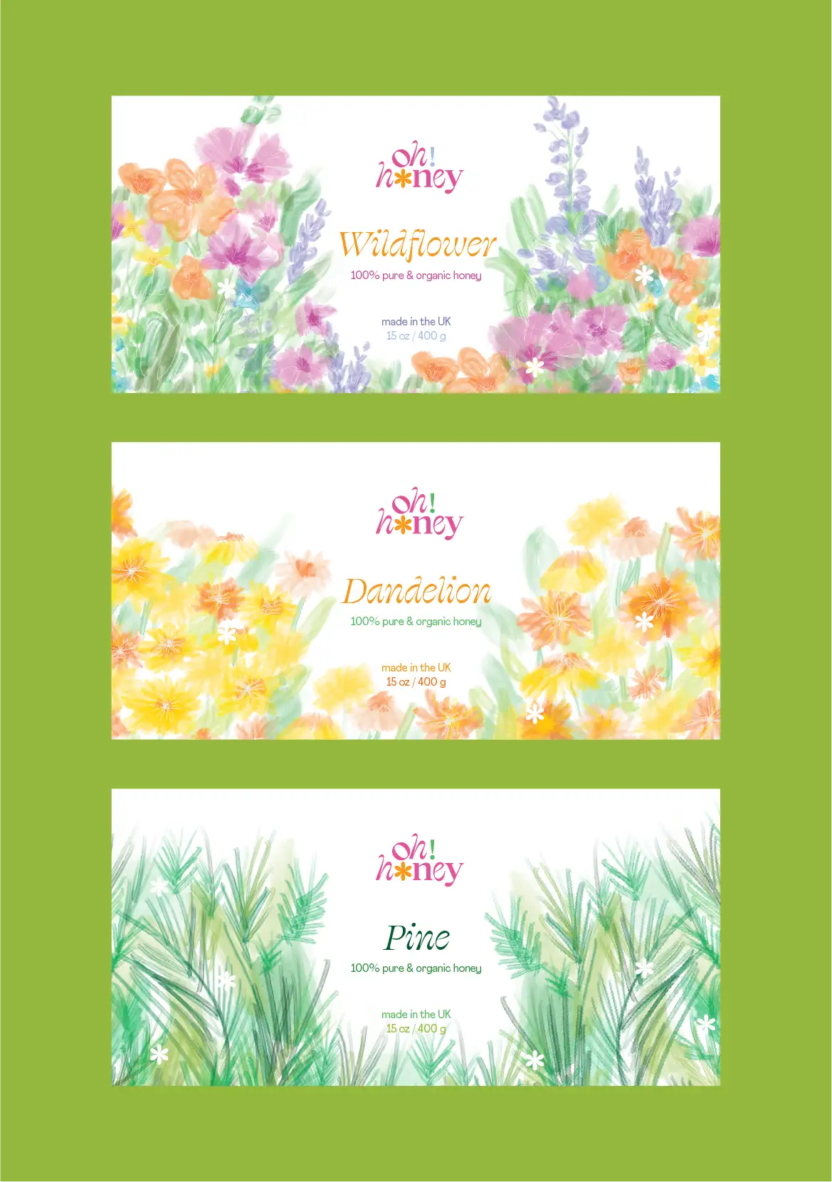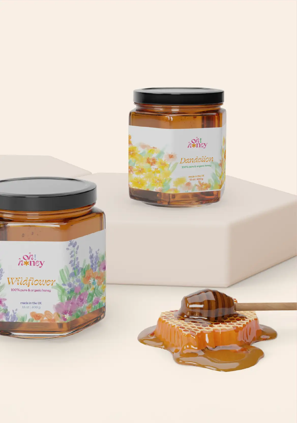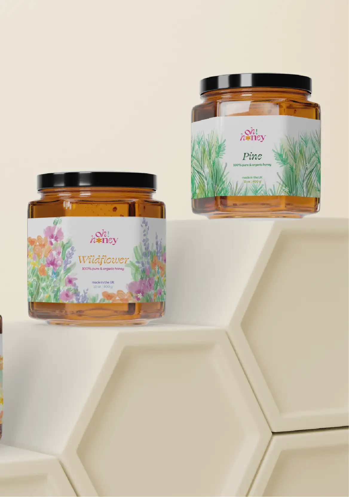


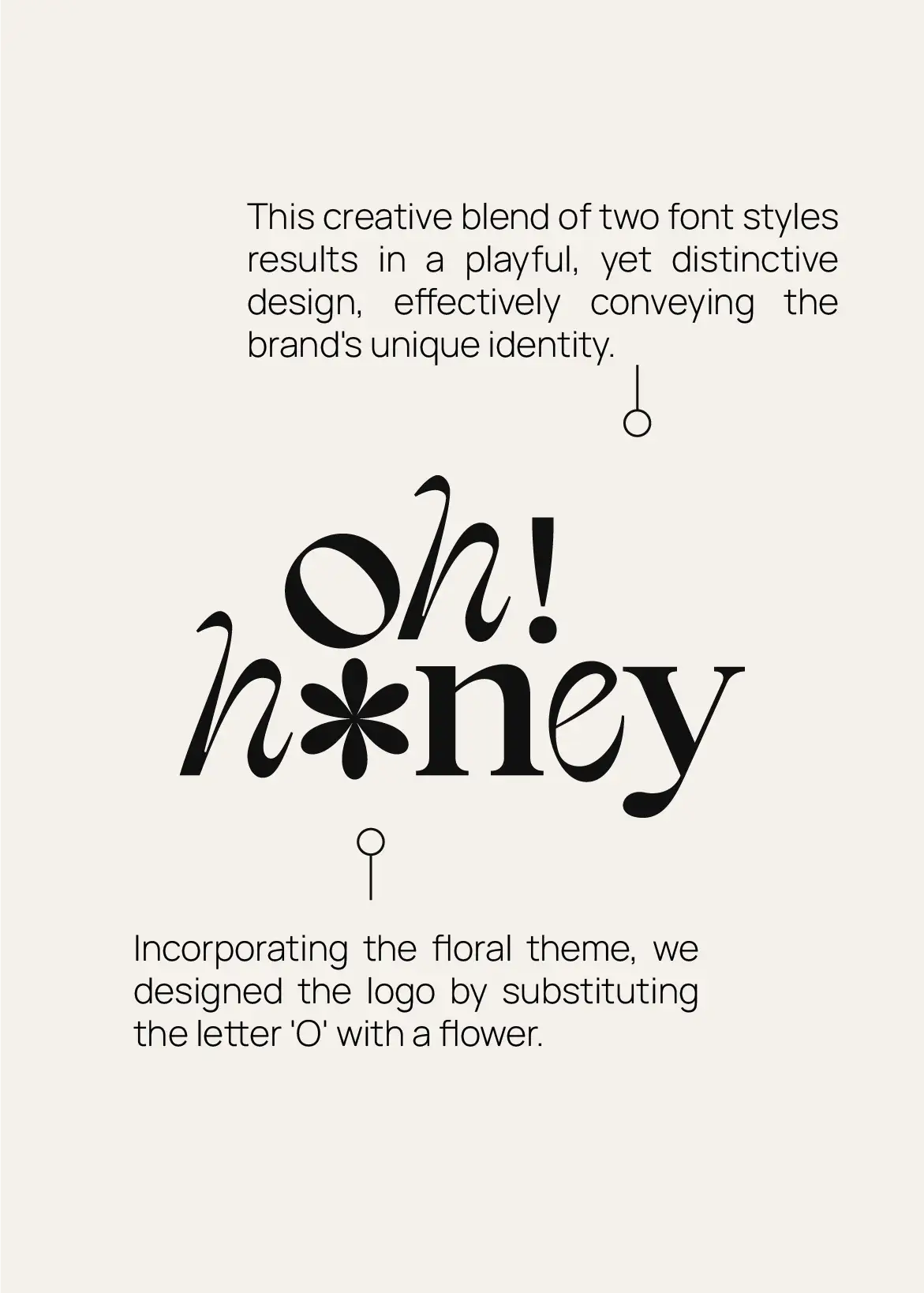
We noticed that honey jars and labels in stores and markets typically featured earthy tones and bee-related imagery, such as honeycombs. So in this project we decided to shift from this common theme, instead opting for a flower-centric approach. This involved creating unique watercolor illustrations and adopting a vibrant color palette. The logo stands out with its blend of two typefaces and a distinctive, custom flower integrated as the letter 'O'.
