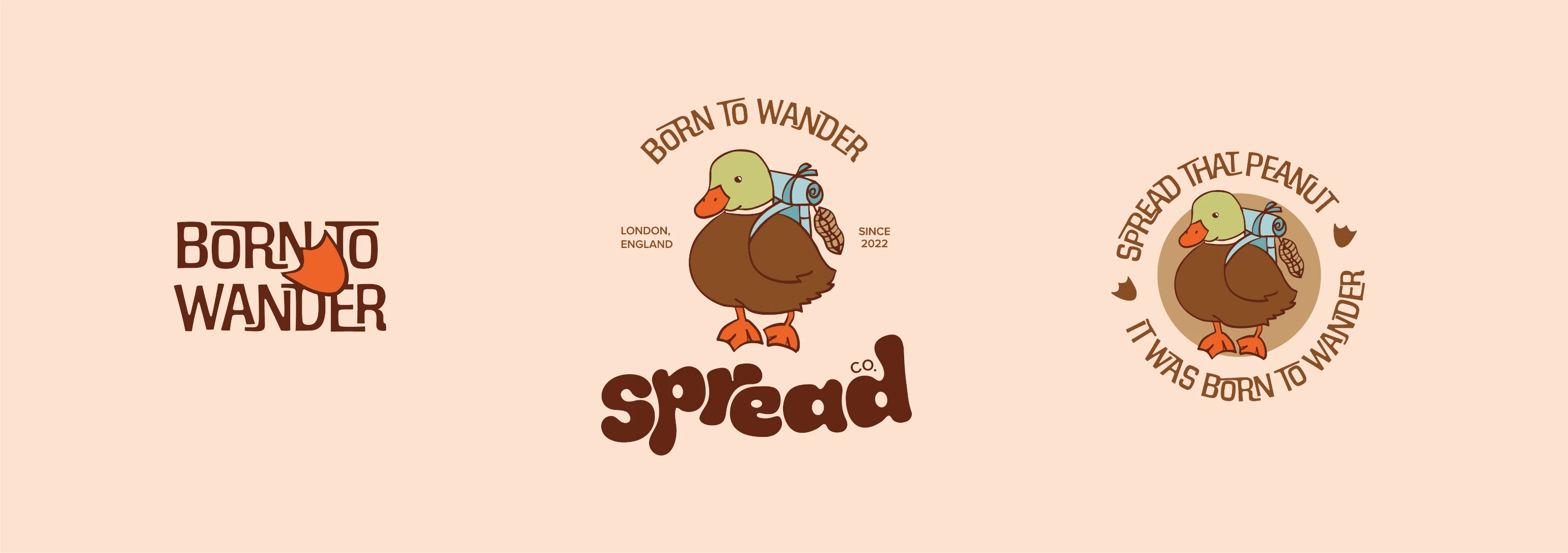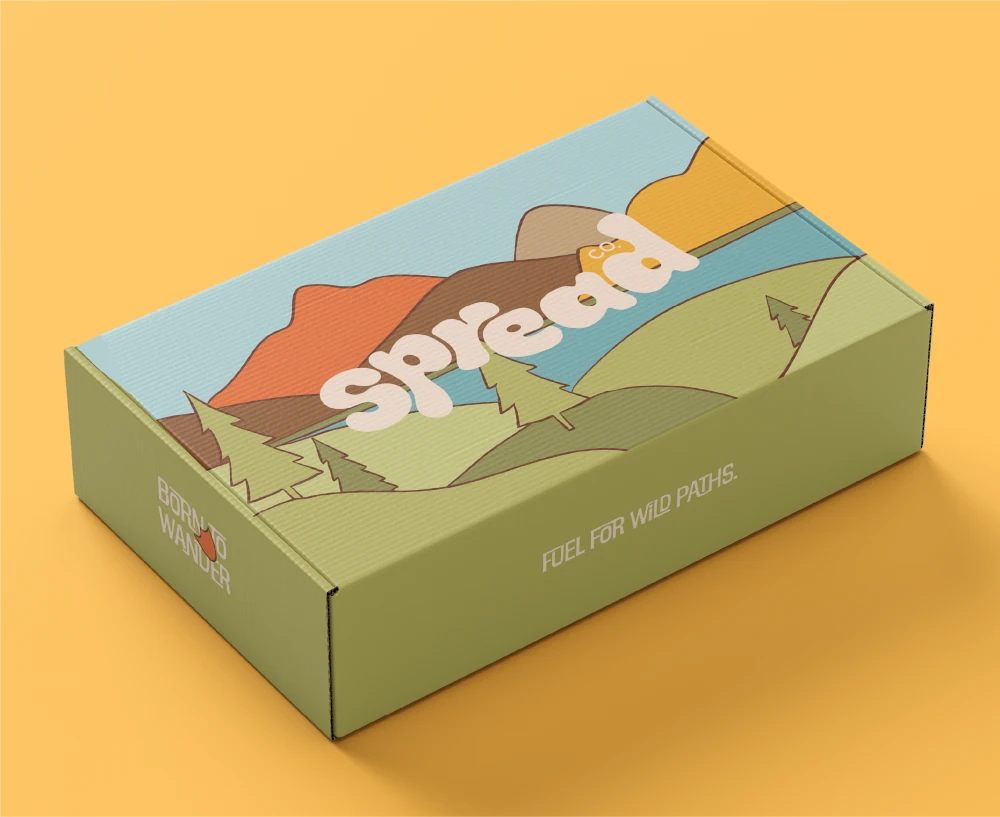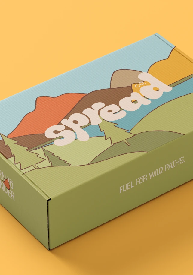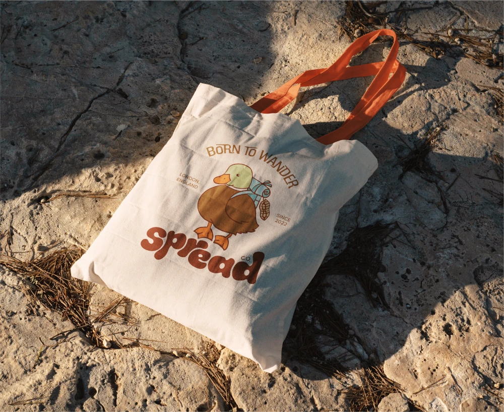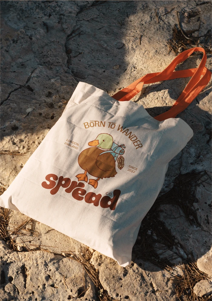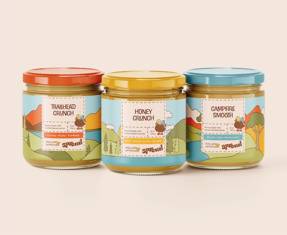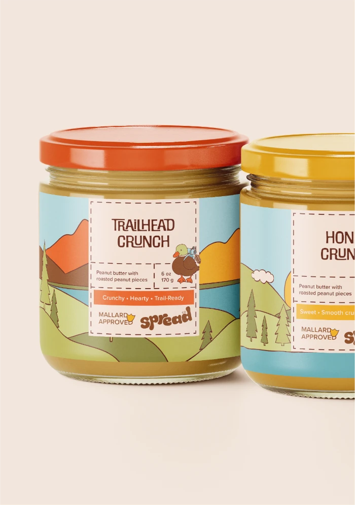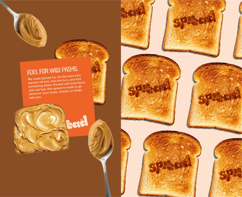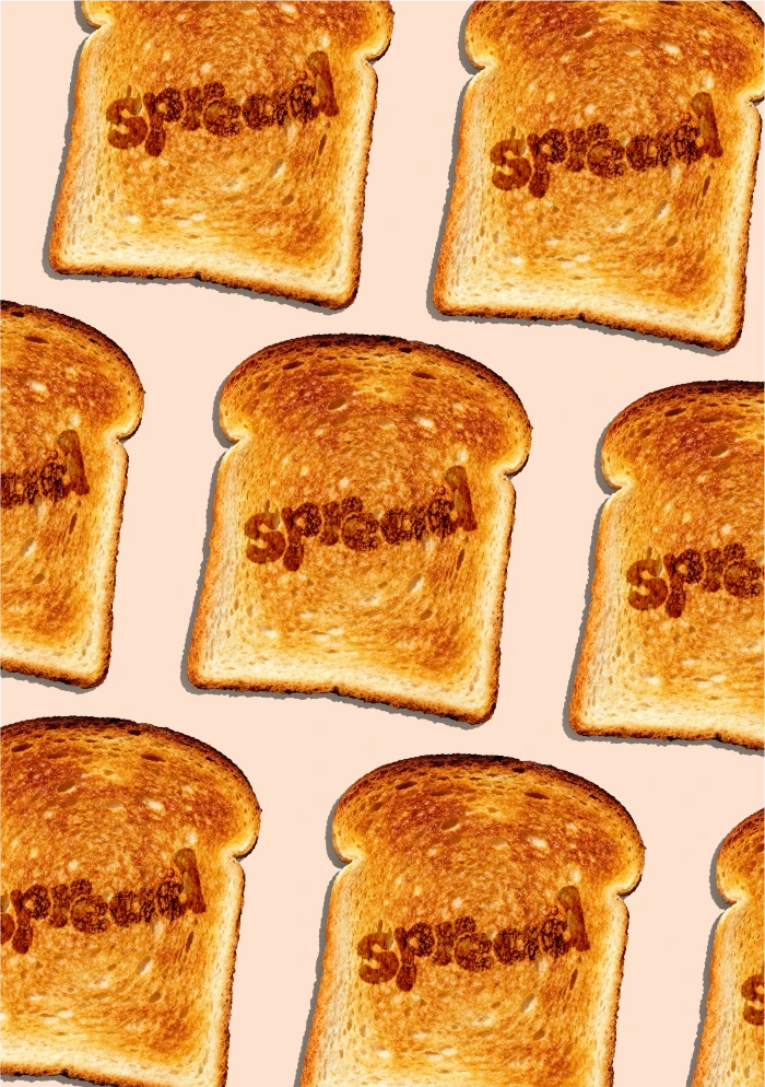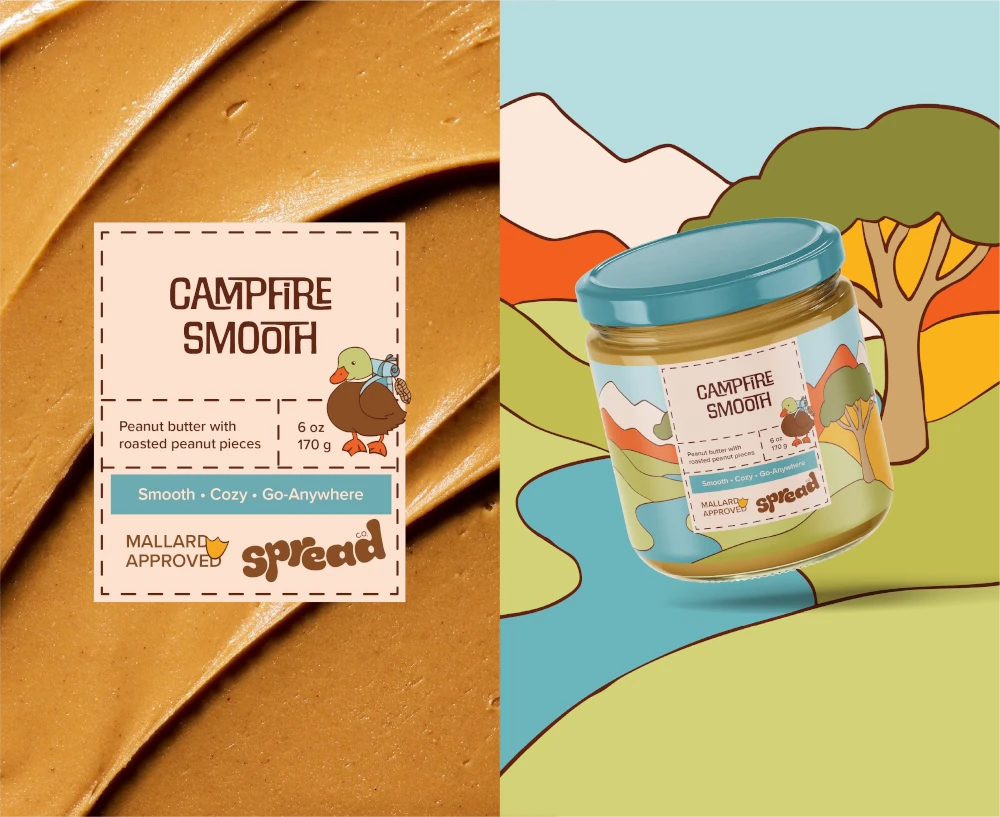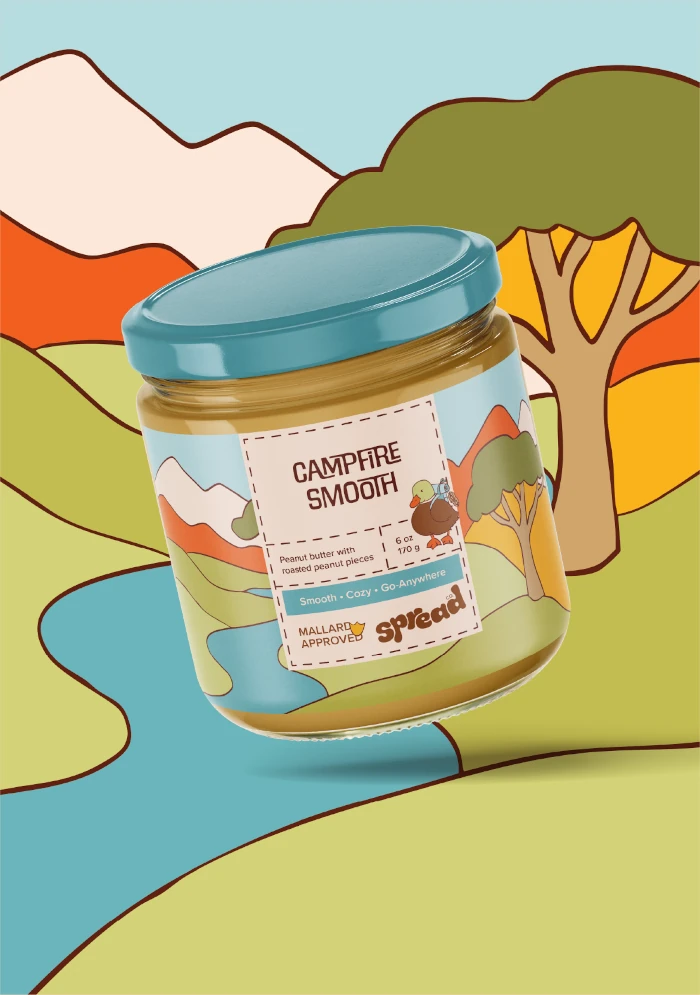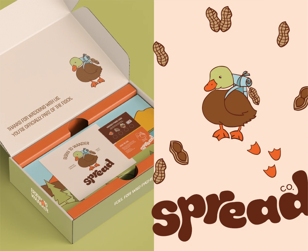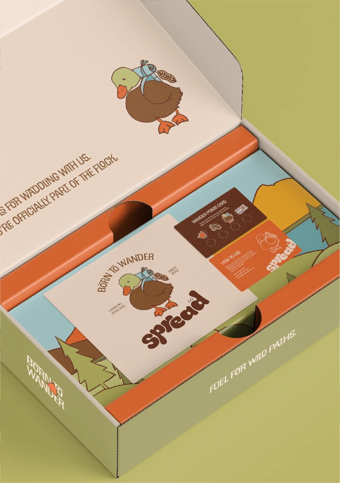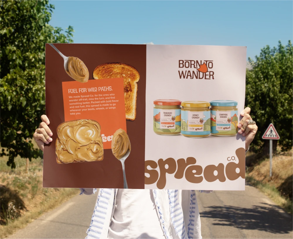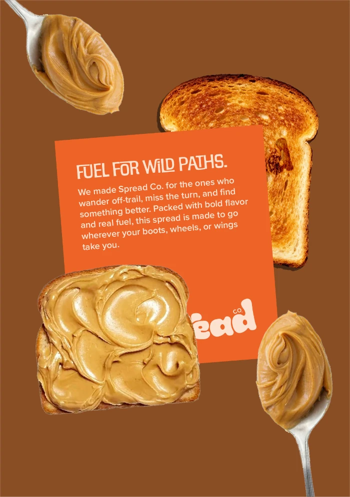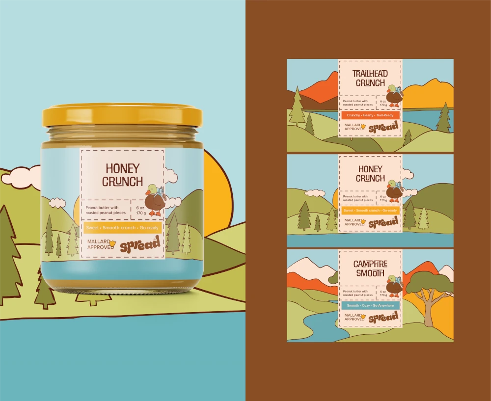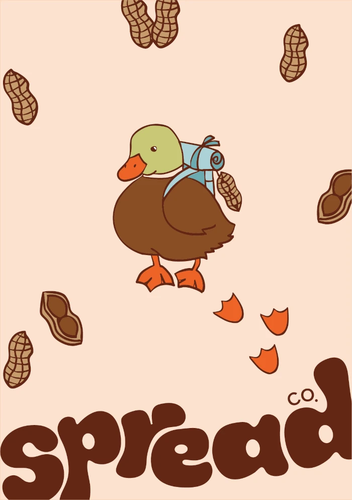



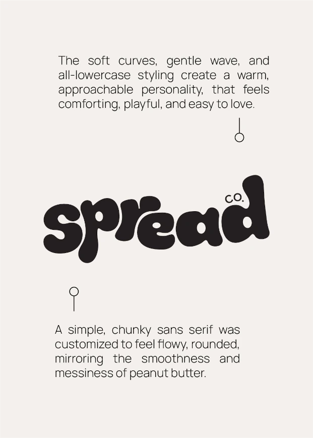
What would peanut butter look like if it was made for wandering, not cupboards? That's what inspired us while creating Spread Co, a joyful peanut‑butter brand for people who wander. It's portable, a little goofy, and made for the trail. For the palette we chose trail greens, water blues, sunrise yellows, campfire oranges, and earthy browns to feel outdoorsy yet playful. A flowy, imperfect wordmark evokes peanut butter being spread, while Peanut, the mallard mascot of the brand smudges footprints all over, bringing movement and character. Additionally a sturdy, outdoorsy type ensures legibility on labels, showcasing practical, and a little cheeky tone.