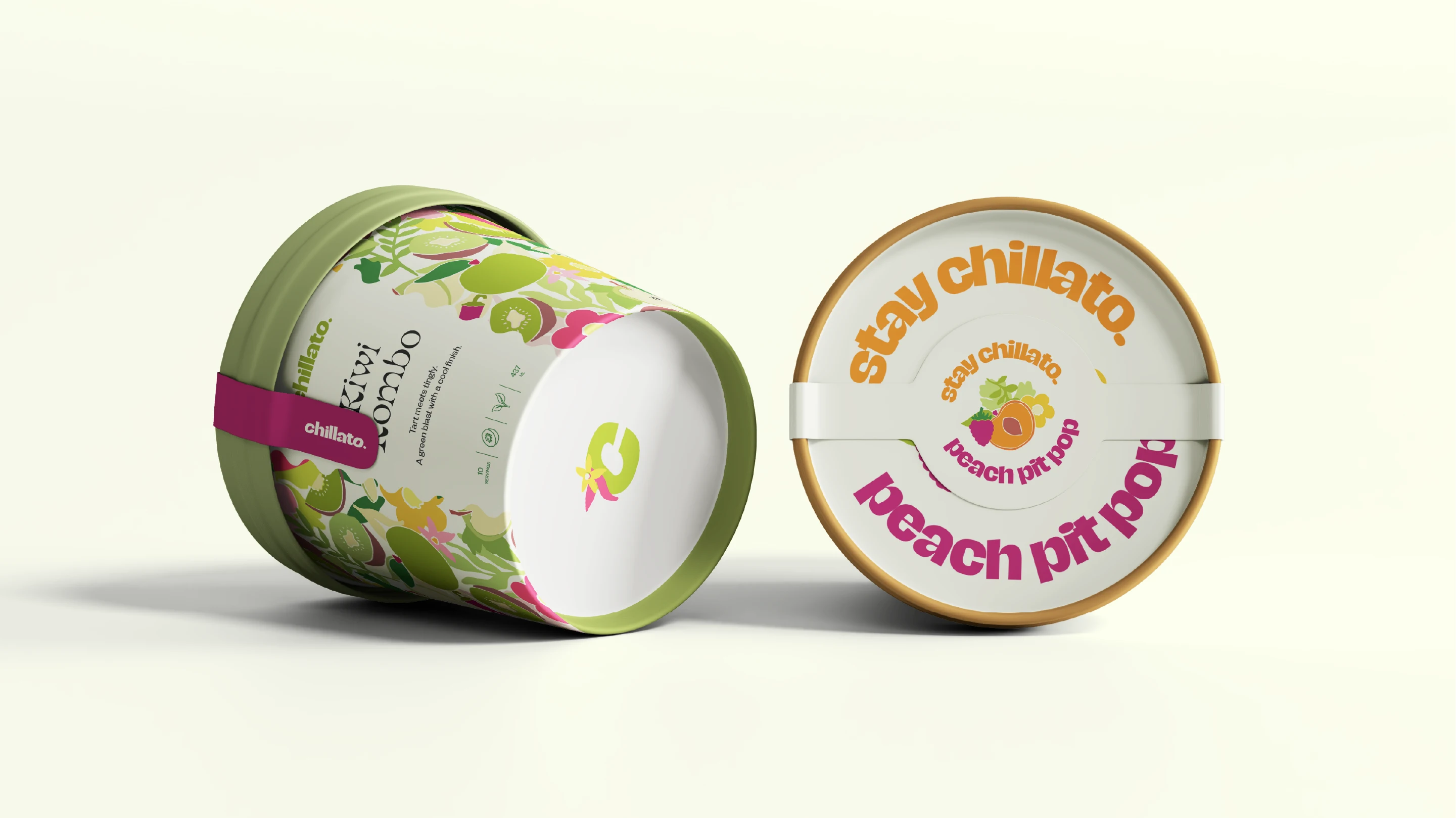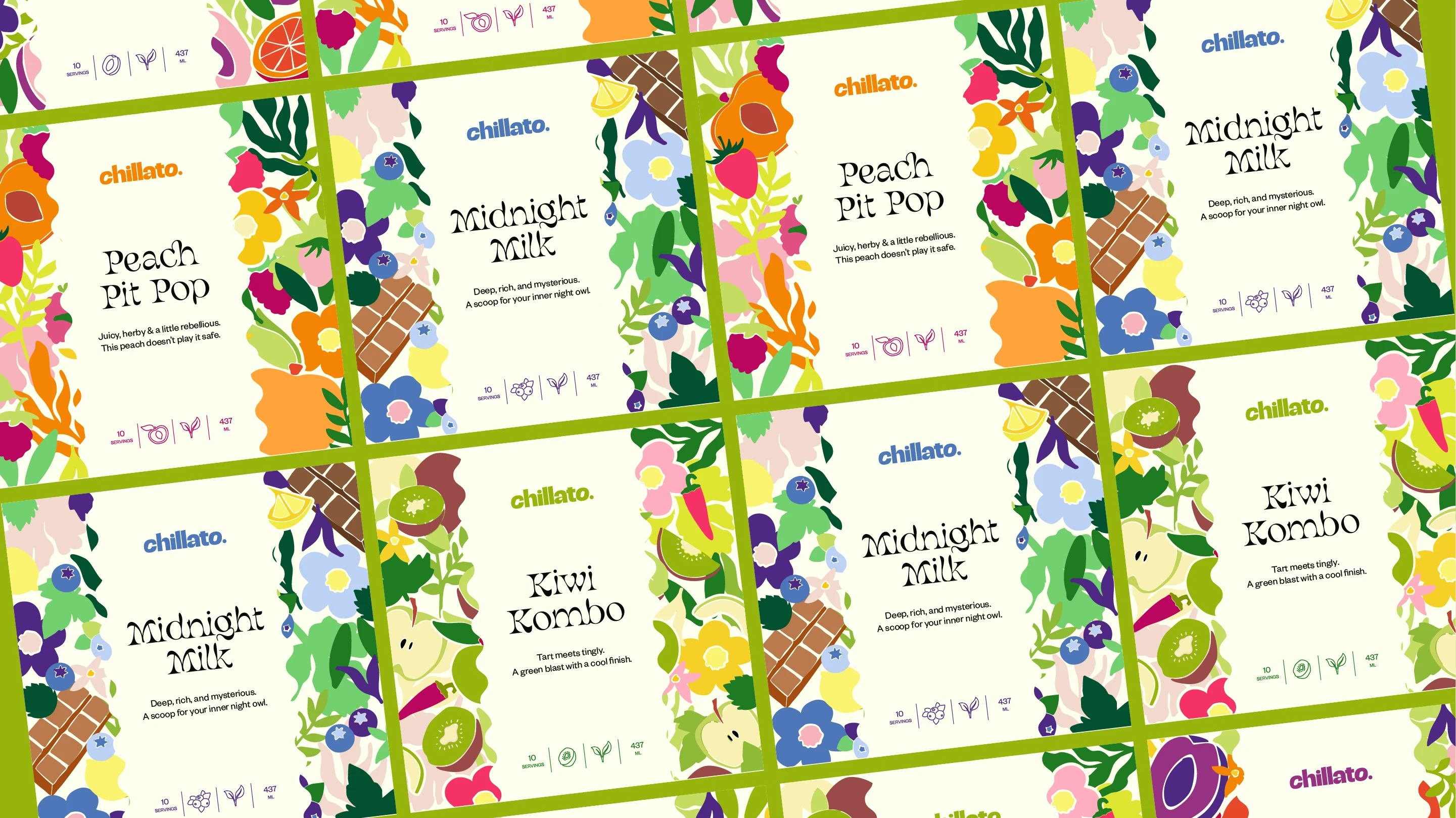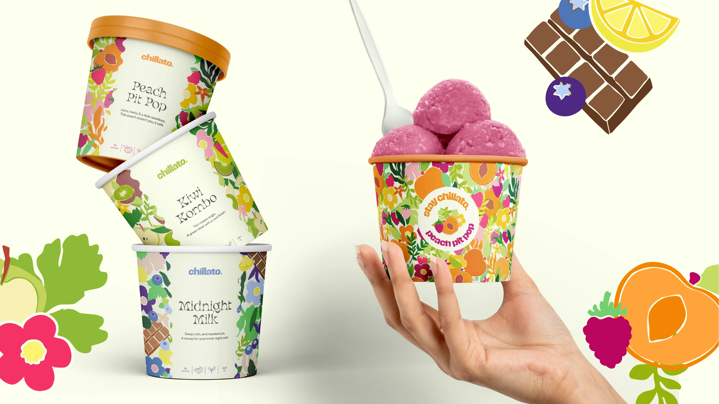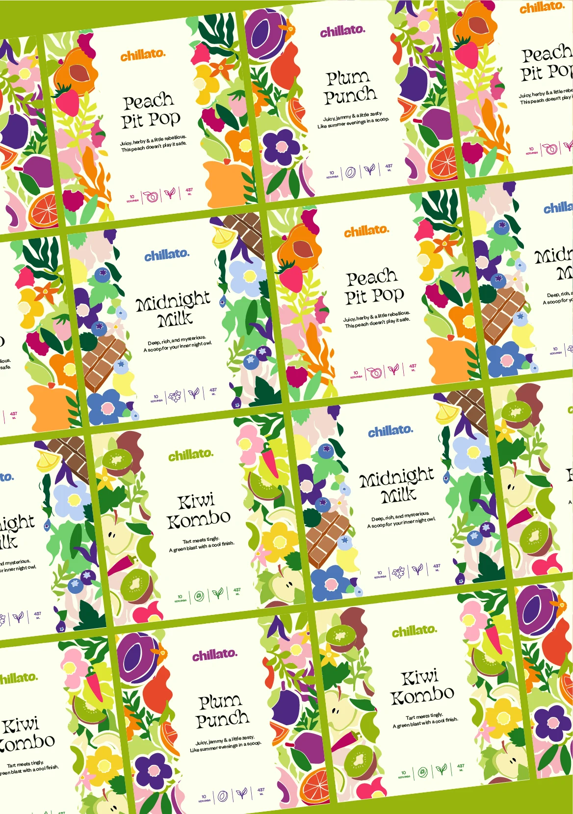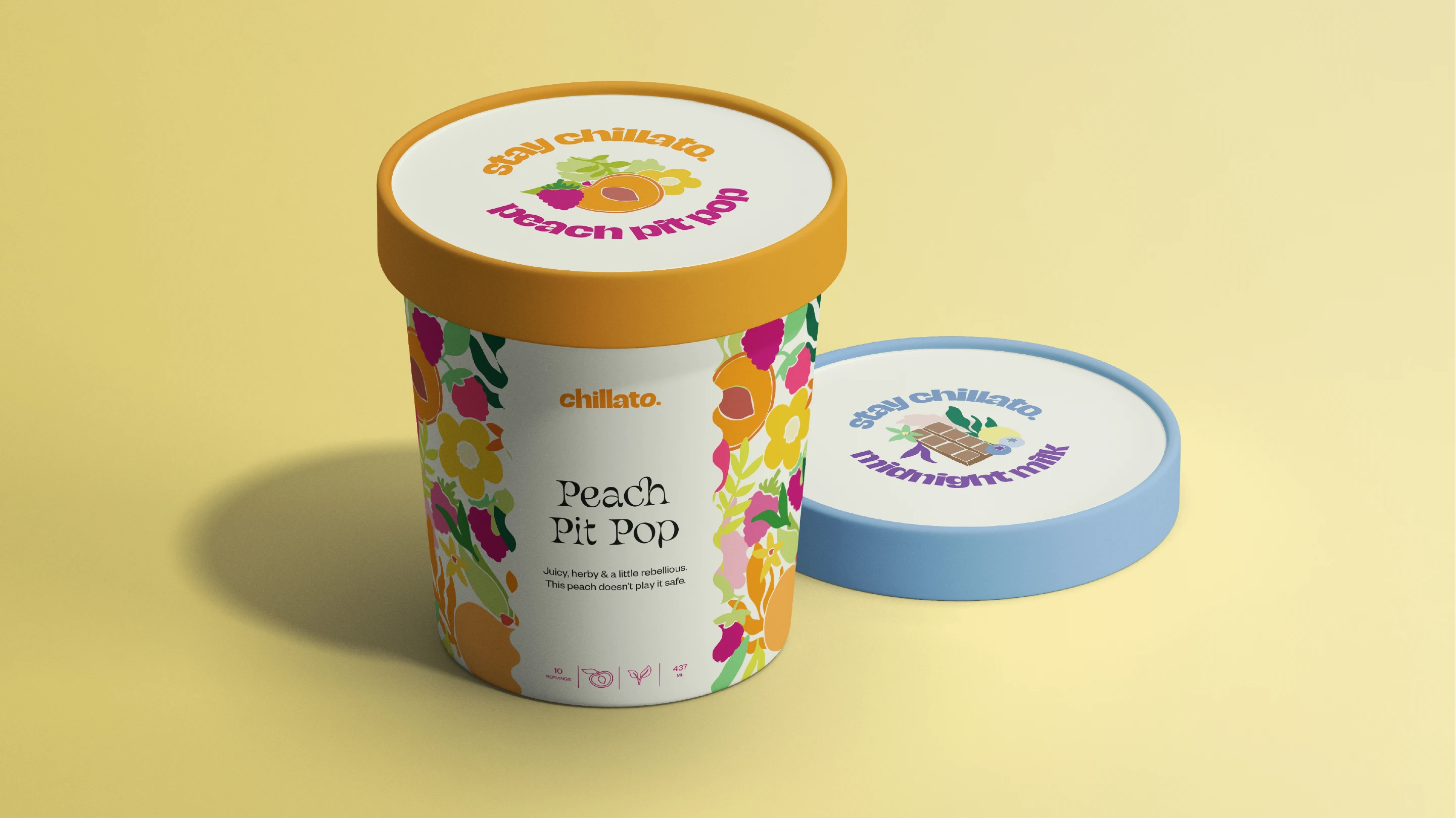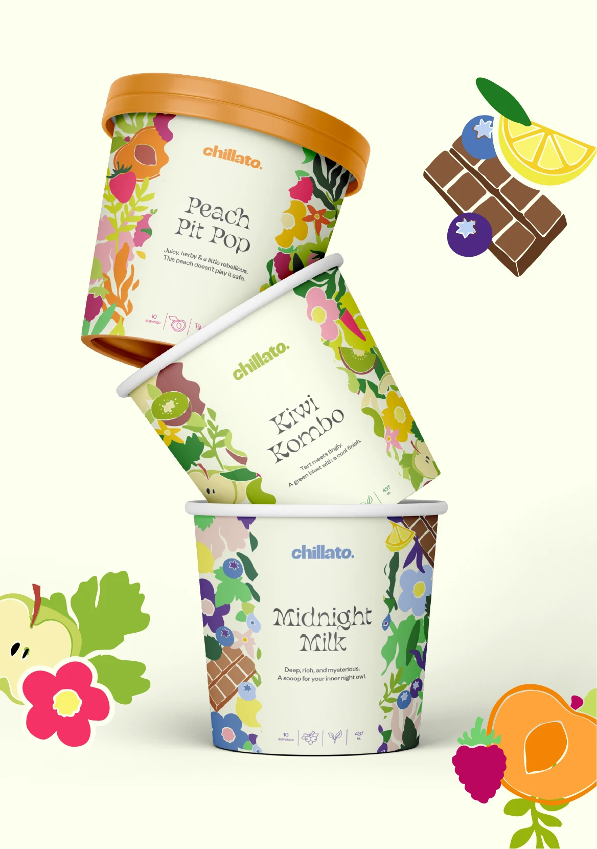


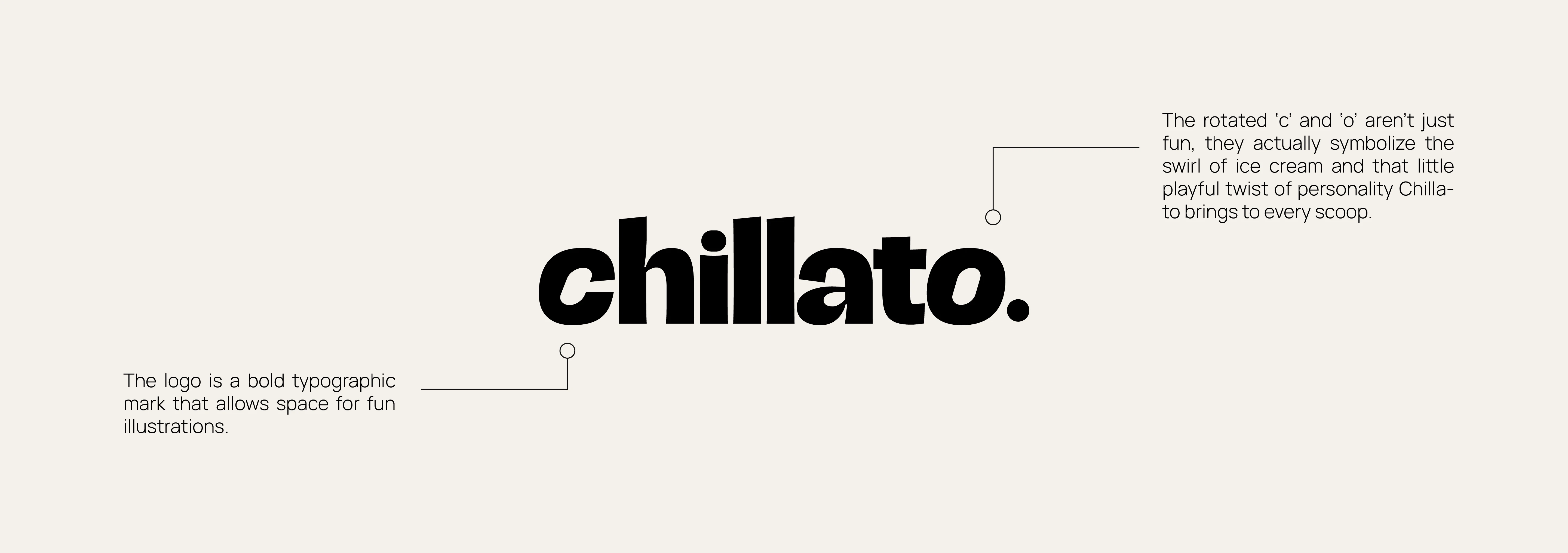
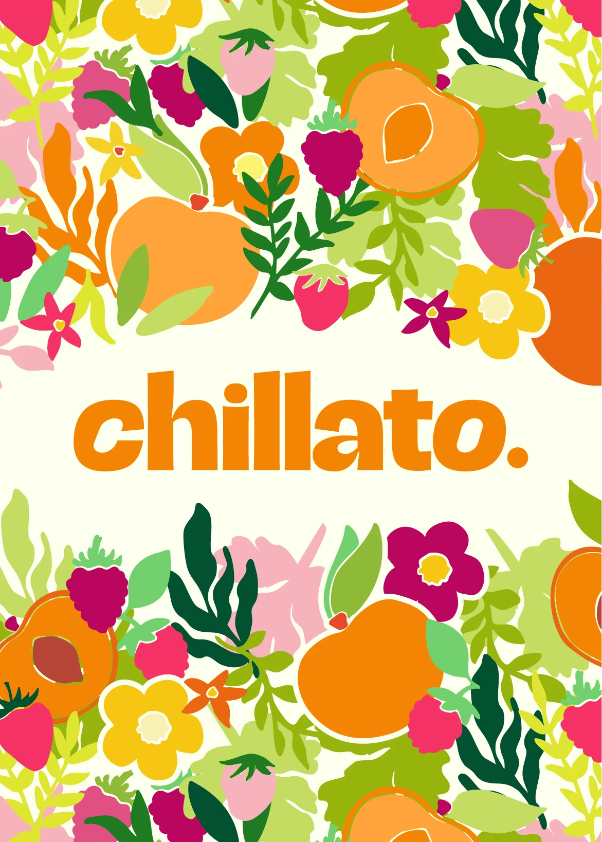
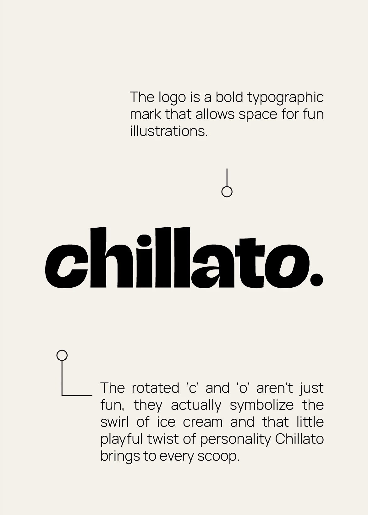
Chillato is a fruit-forward ice cream brand made for flavor explorers and joy-seekers alike. Their scoops are anything but basic: think bold, real-fruit flavors with fun combos and creamy textures that really stand out. For the visual identity, the goal was to capture the essence of summer, colorful, playful, and effortlessly chill. We developed a typographic logo that stands strong on its own while allowing space for rich, detailed illustrations. These illustrations (featuring fruit and floral elements tailored to each flavor) are the heart of the brand, bringing a fresh, energetic vibe to every touchpoint.