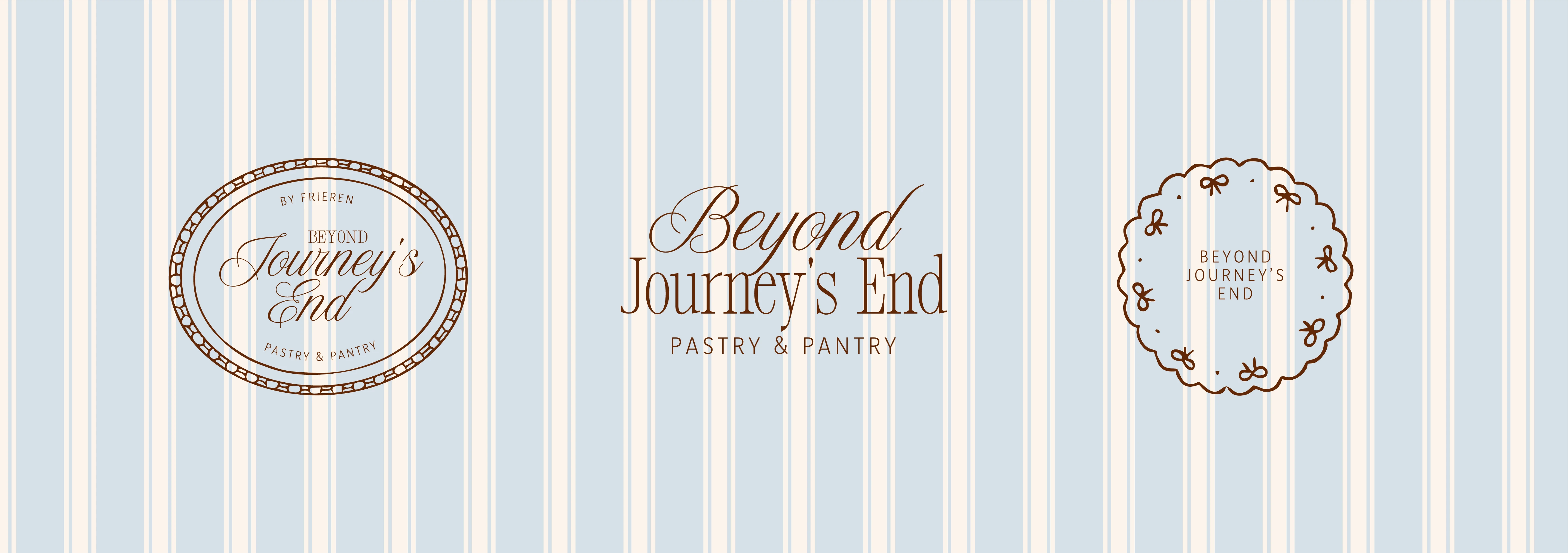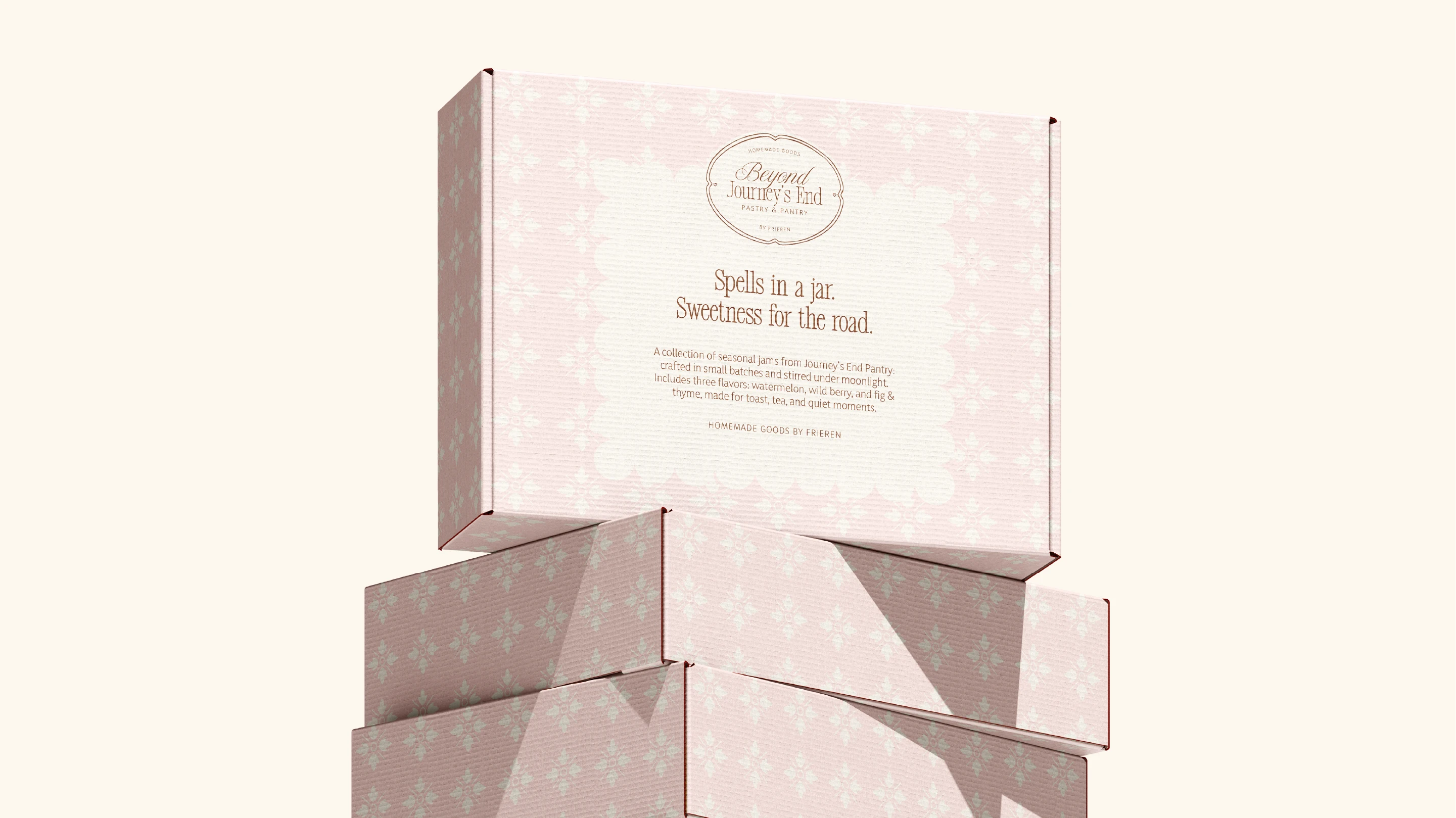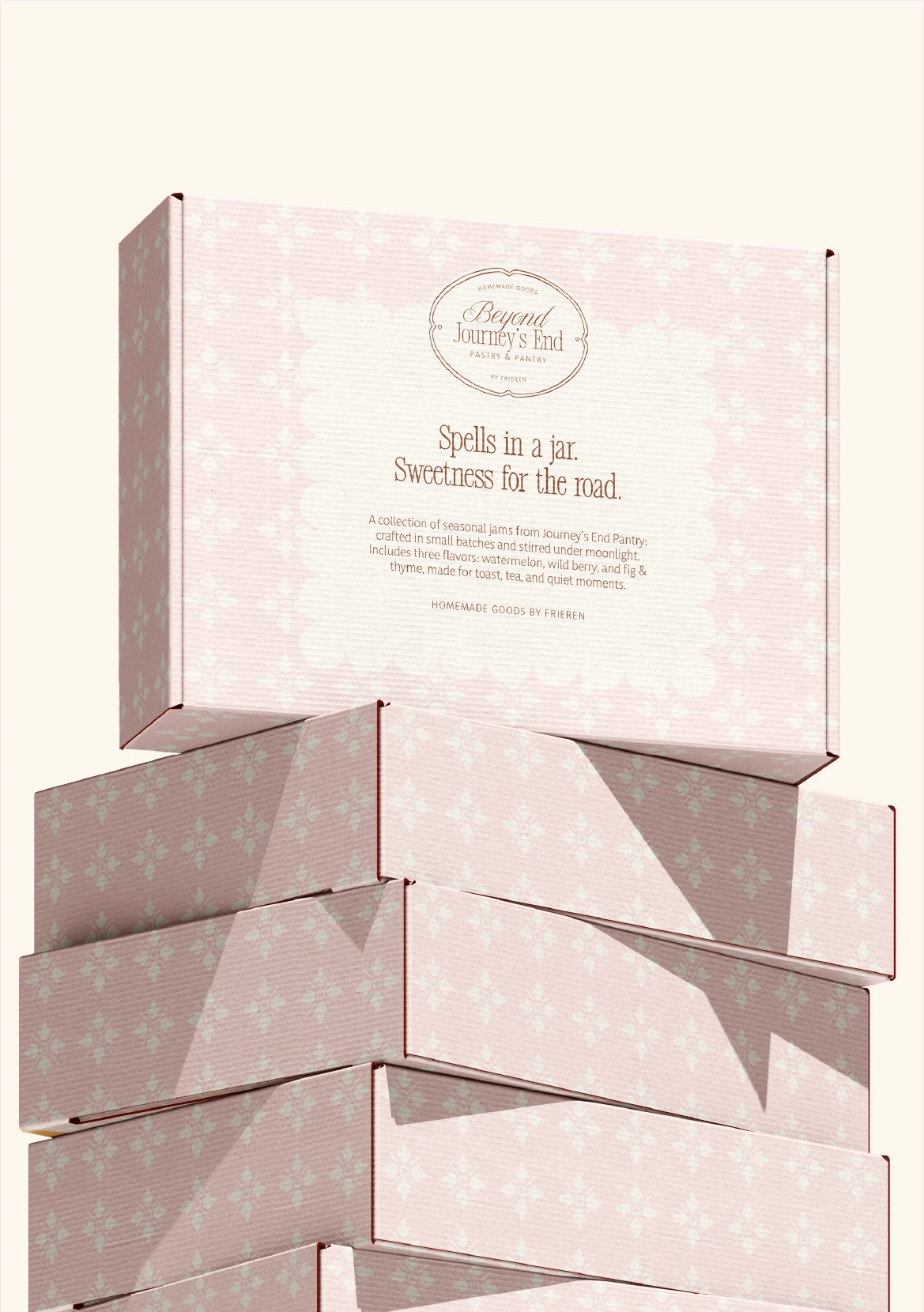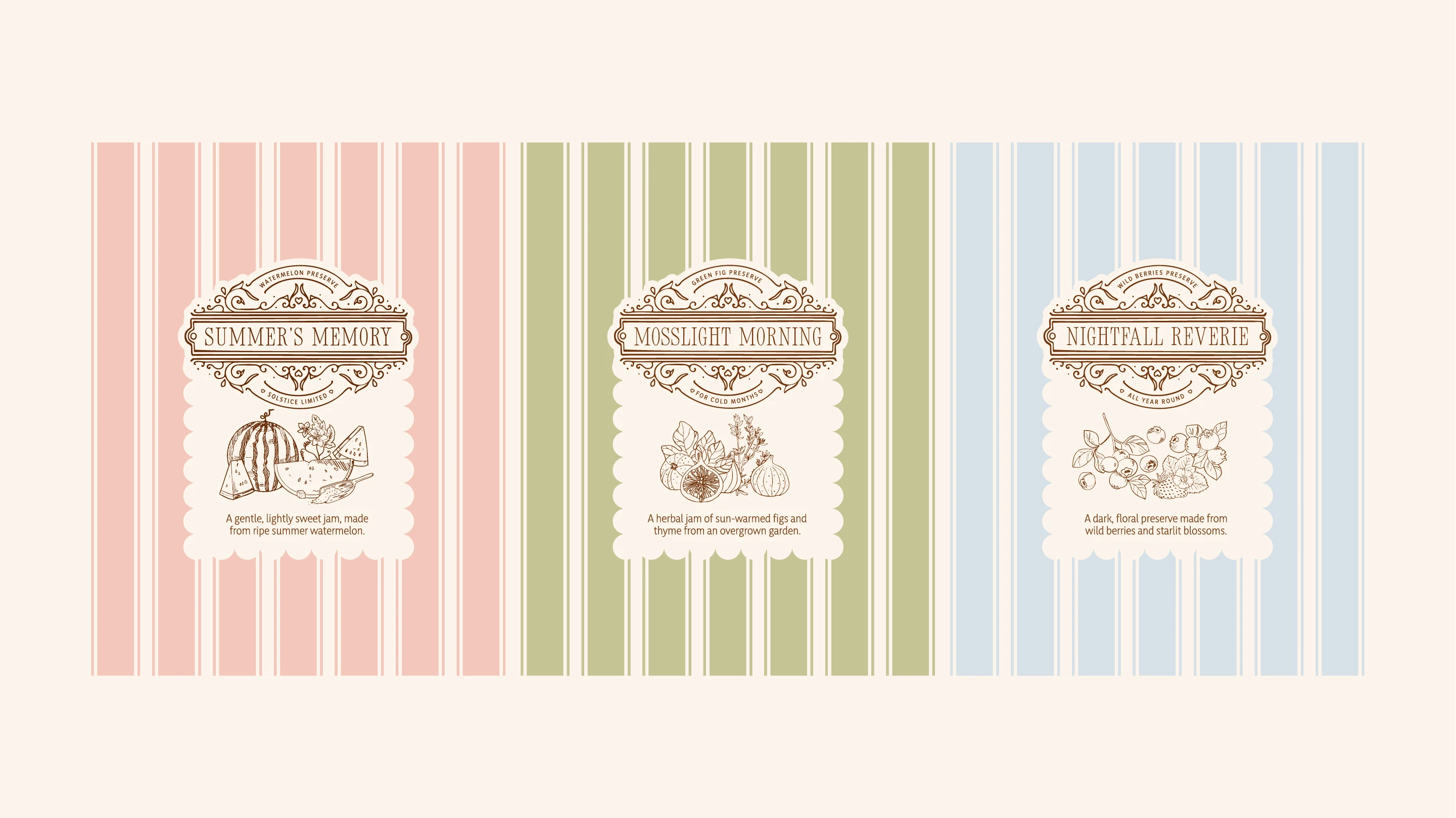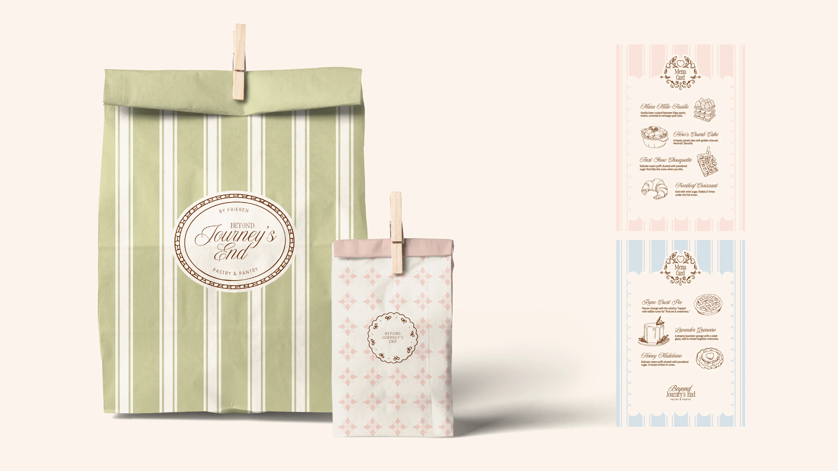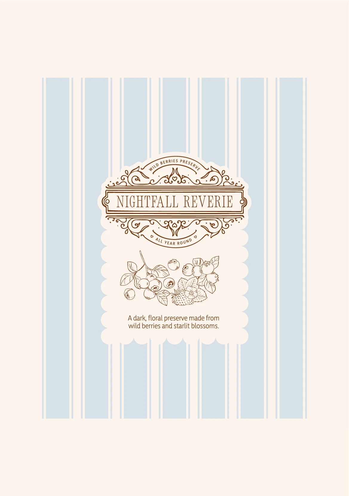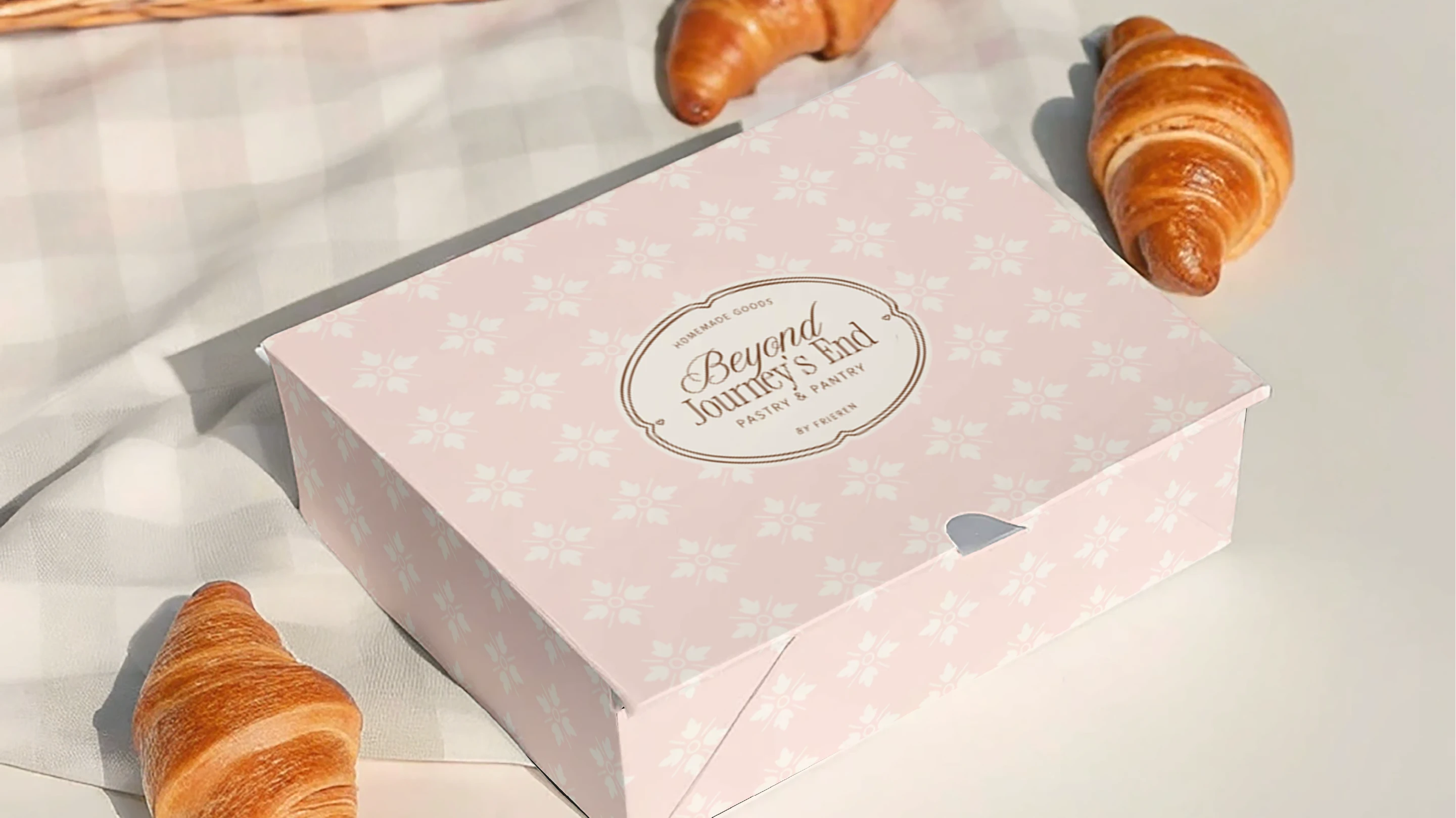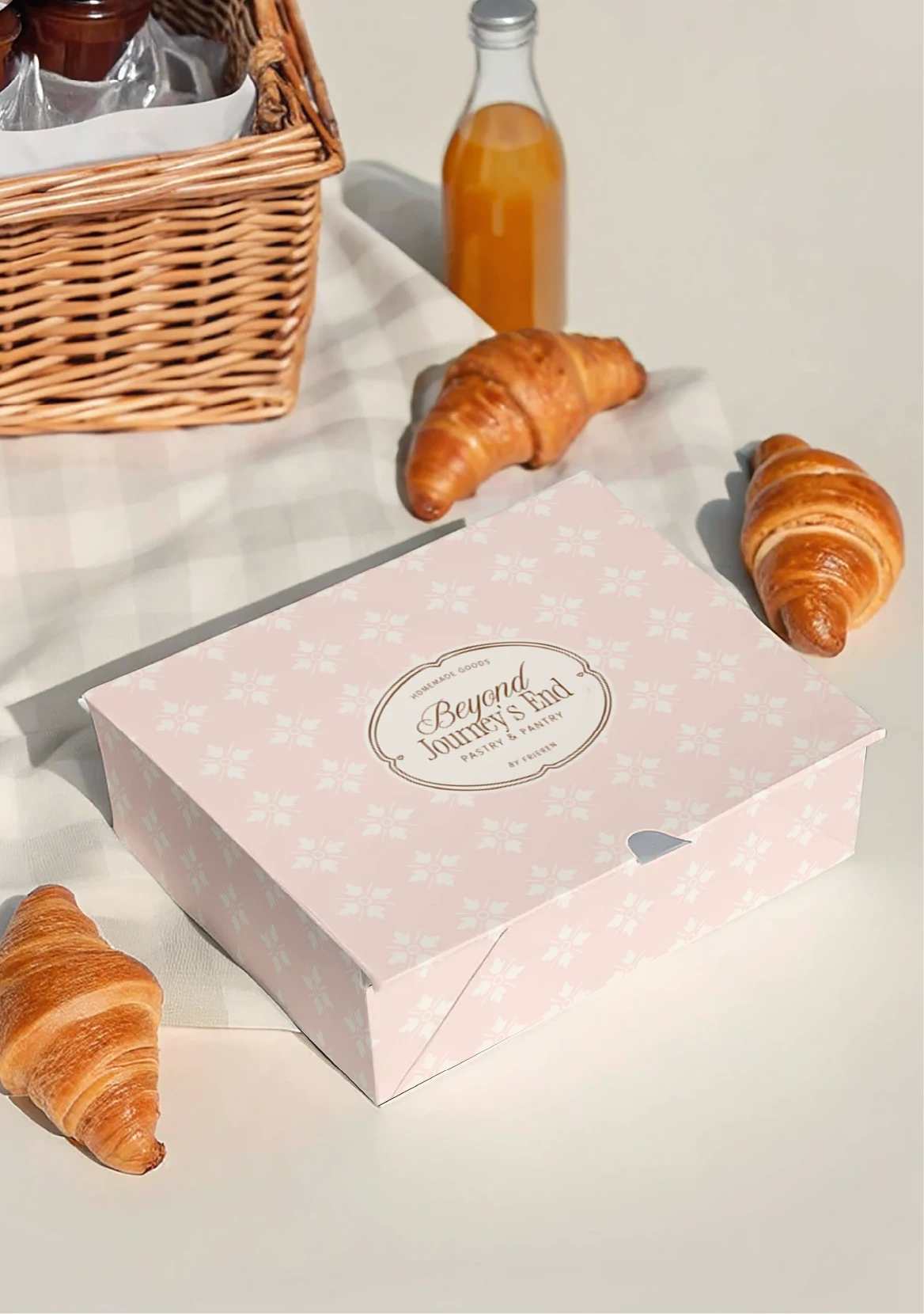
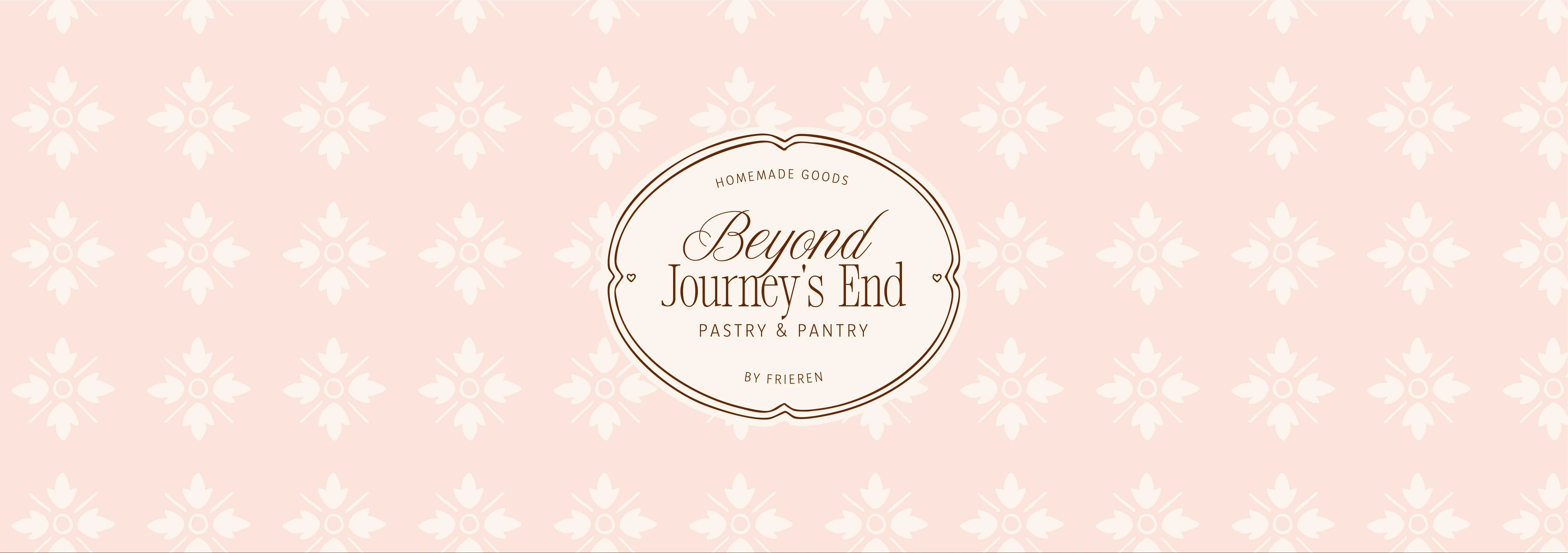

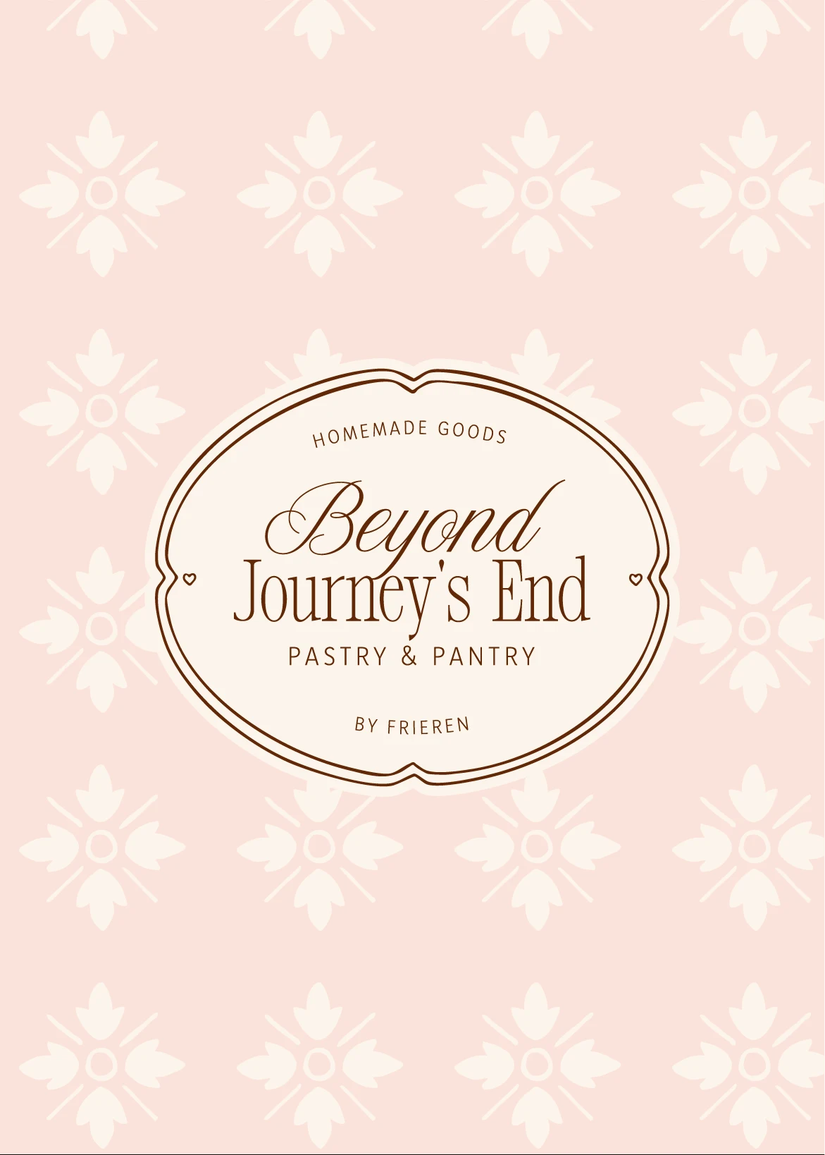
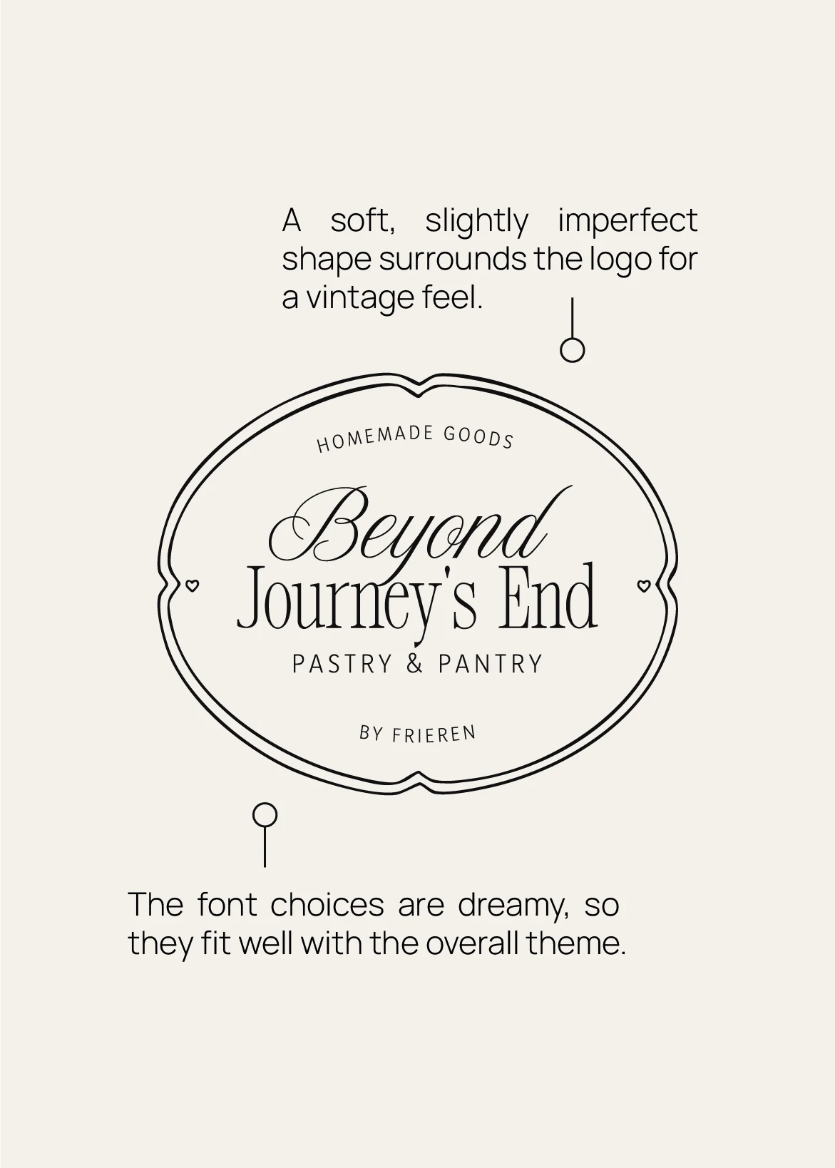
A cozy, handmade brand concept inspired by Frieren: Beyond Journey's End, imagining what it might look like if Frieren opened a tiny pastry and pantry shop. A soft, elegant serif and script pairing was used, something you'd spot tucked into a well-loved spellbook. The palette builds up from soft, lived-in colors that feel like they belong in a tiny pastry shop at the edge of a sleepy magical town. To add texture and charm, we created vintage-inspired patterns (think tea towels and jam jar fabrics), hand-drawn elements, and custom borders for labels and menus. Every detail was designed to feel like it came from a quiet corner of a fairy tale.